YouTube Redesign Launched
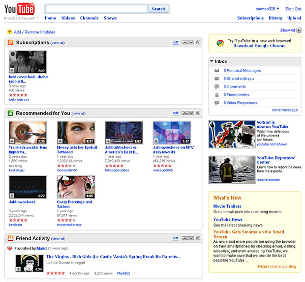
A few months ago, there has been some news that YouTube is redesigning their home page. They enhanced their masthead, navigation as well as the interface. As you will notice, their Masthead (top navigational area) has been changed into a more likely search engine for videos style. I believe that this new change is now live to all users so try and check out the change for yourself. Seems like many major sites have been redesigning their home page more recently. Just like the redesign of the Twitter home page that I blogged a few weeks ago.
YouTube also blogged about the redesign of their home page. They explained over there some of the new features added and a few features that were removed. Check out the post and screenshots below:
YouTube MastHead Before:

YouTube Redesign:

“You may notice something looks a little different about our masthead (top navigational area on the homepage) today, and that’s because we’ve done a bit of housecleaning. We’ve streamlined and simplified the design to focus on the primary experience of YouTube: watching a video. The left side is dedicated to exploration: finding videos to watch through search and browse. The right side is all about organization of the videos that matter most to you: your subscriptions, your recent viewing history, and your own uploads.
A few features have been removed from this area, to keep it as clean and functional as possible. Your Quicklist, all the videos you tagged to watch later, can be found here: http://www.youtube.com/my_quicklist, and the country and language pulldown menus, once at the very top of the page, are now in the footer.”
Share your thoughts… 🙂